Rebranding for Inclusivity and Growth
Challenge: As Christian Community Homes & Services grew in size and services, its brand faced a few hurdles, one being misconceptions tied to symbolism in the logo. While the symbol reflected its heritage, it discouraged some prospective residents and employees who assumed a religious affiliation would shape care or workplace culture.
Approach
We began with a full brand audit—surveys, internal and external feedback, and market analysis—then delivered:
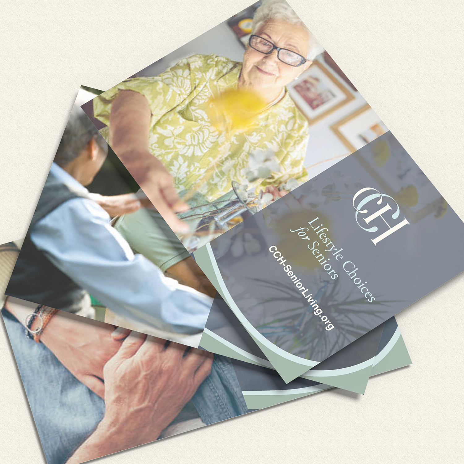
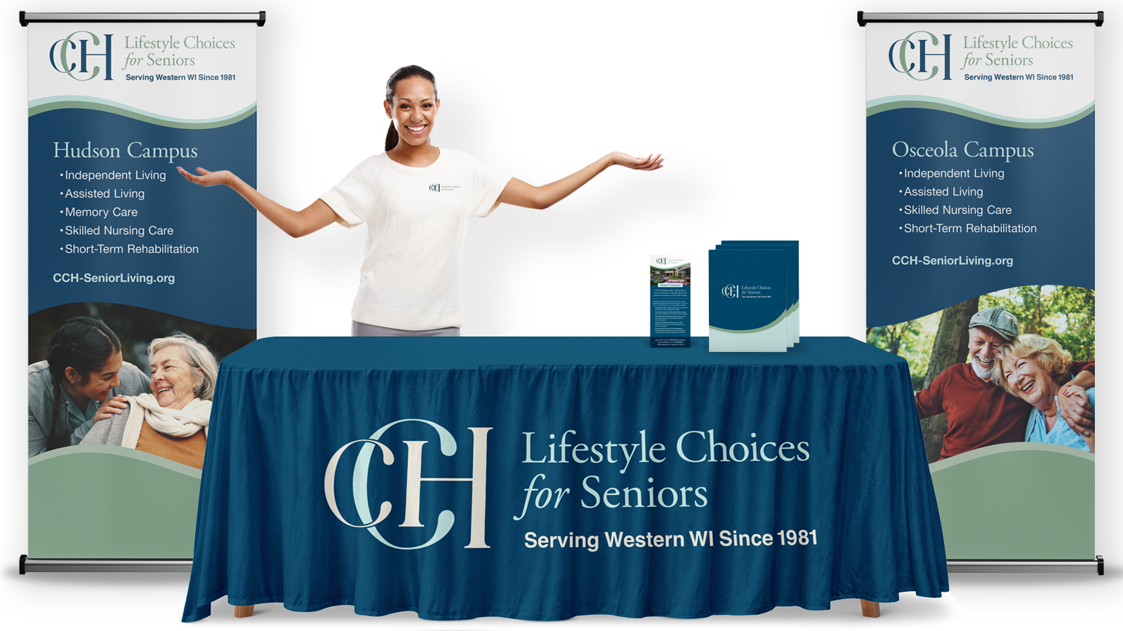
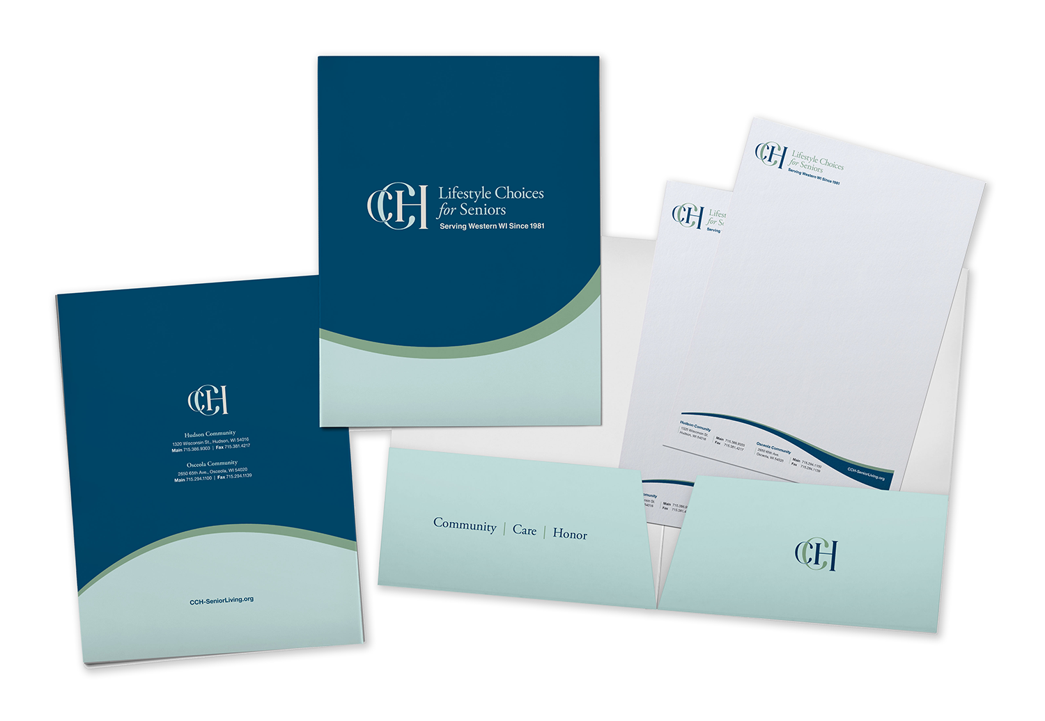
A unified brand direction and guidelines
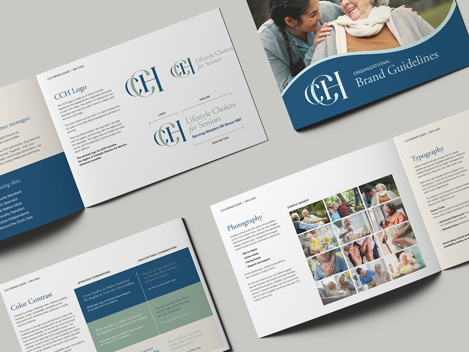
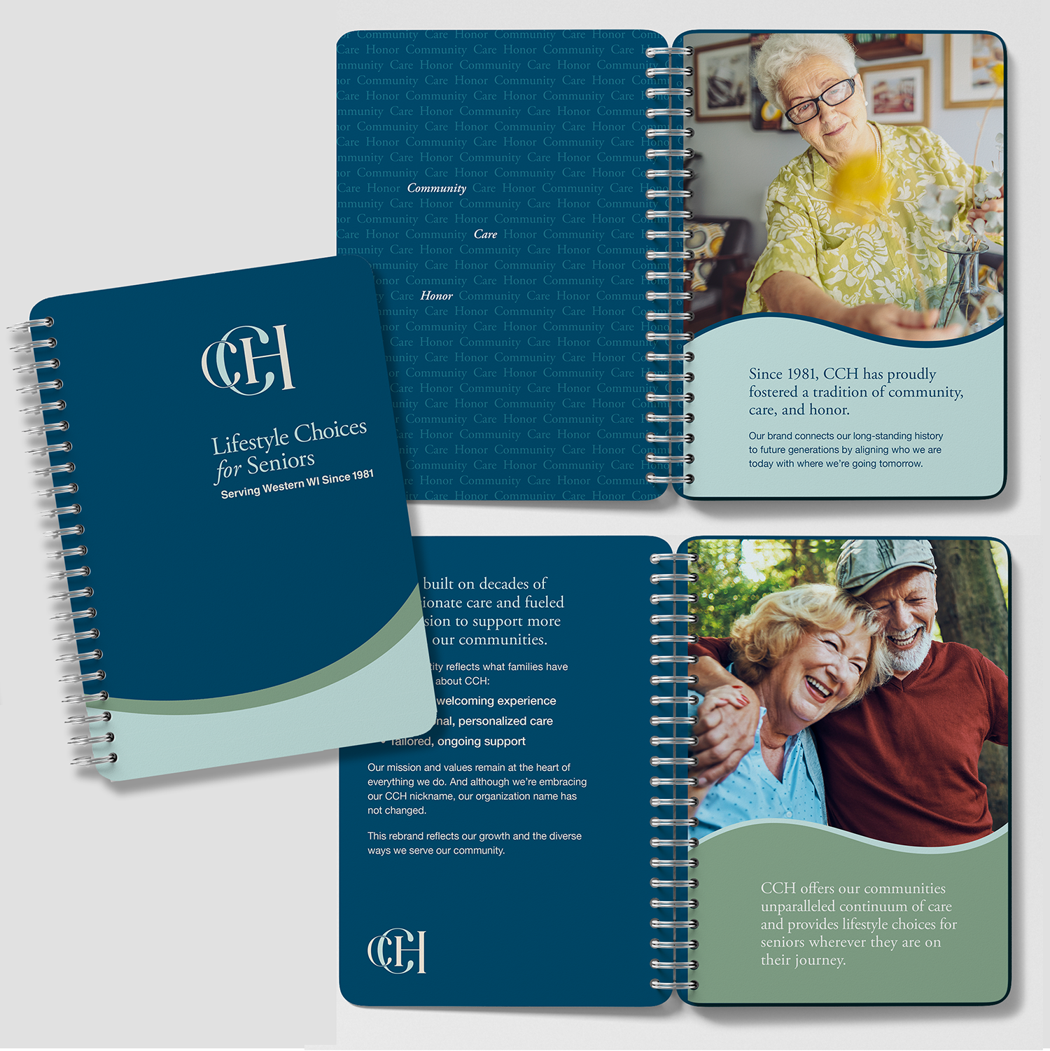
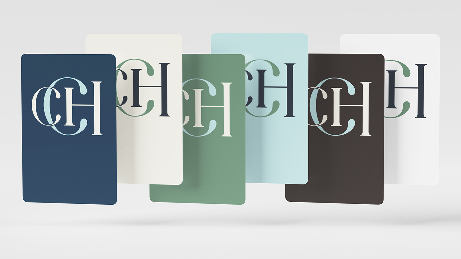
Cohesive logo and visual identity focused on CCH letterforms, not religious iconography
Renamed properties for alignment under the CCH umbrella
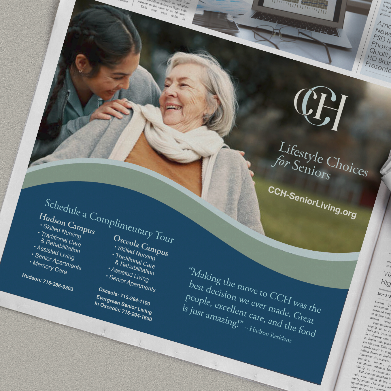
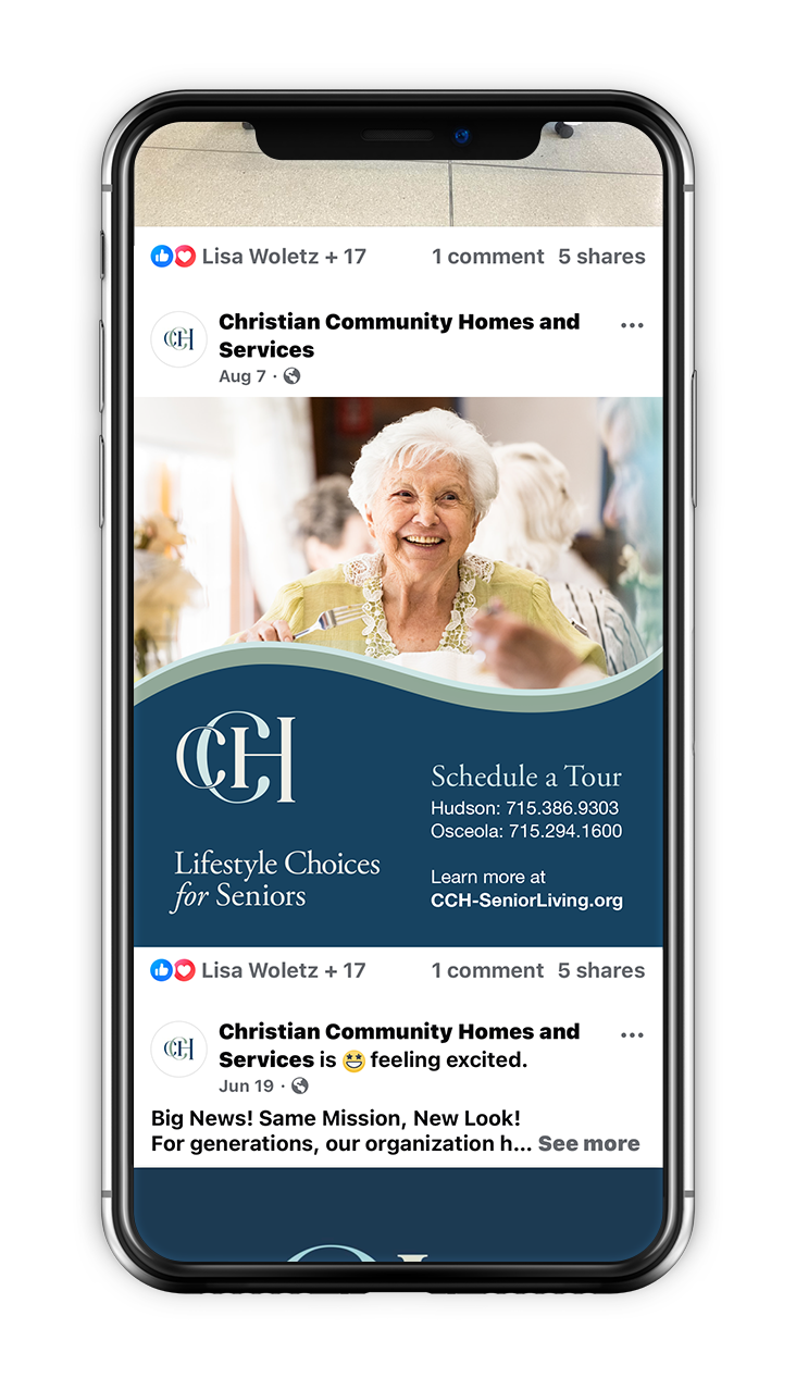
Templates and event materials to ensure consistent rollout
The rebrand unfolded in two steps: first, embracing the long-used nickname “CCH” for quicker recognition; second, refining the logo to broaden appeal.
Impact
The refreshed brand removed barriers, fostered inclusivity, and positioned CCH for continued growth in services, partnerships, and workforce recruitment—while honoring its trusted reputation in the community.